
8 min read

How to prevent search engines from indexing a page
Sometimes, you don't want Google, Bing or whoever to find the page you publish (noindex). This applies to Thank You Pages, system pages, etc. Other times, you want to prevent them from following/indexing the links on a page (nofollow).
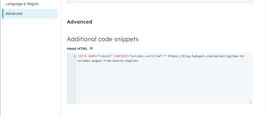
To prevent search indexing add this in the page's head HTML in the advanced settings menu
- "For "noindex": <META NAME="robots" CONTENT="noindex">
- For "nofollow": <META NAME="robots" CONTENT="nofollow">
- For both "noindex" and "nofollow": <META NAME="robots" CONTENT="noindex,nofollow">

CSS - the special design touches that makes the blog "TimeLog" (in Danish - sorry)
Du finder altid feltet til modulets CSS classes og ID under enten:
- Custom ID & Classes (code)
- ///// Row Settings → ///// Code (The Nerdy Stuff)
ID’er:
dark-bg
Dette ID gør alt tekst i modulet hvidt. Sættes på modulet, når baggrunden er mørk.
Man kan også skifte tekstfarven til hvid direkte i tekst-editoren. Her skal man bare huske, at skifte til “dark editor” bagefter.
Classes:
Lister med ikoner:
check-list
Indsættes når lister skal have flueben ud fra hvert punkt. På website pages og landing pages skal man bruge “Bulleted list” og i blogindlæg skal man bruge “Numbered list”
arrow-list
Indsættes når lister skal have en pil ud fra hvert punkt. På website pages og landing pages skal man bruge “Bulleted list” og i blogindlæg skal man bruge “Numbered list”
horisontal-list
Denne class sætter en liste (Bulleted / Numbered) til at gå horisontalt i stedet for vertikalt.
Tekst og CTAer
small-h1
Denne class gør H1-overskriften mindre, hvis den virker for stor med temaets fastsatte indstillinger.
small-ctas
Denne class gør alle CTAer mindre. Bruges fx hvis man har CTAer i tre eller flere ligestillede kolonner, hvor de normale CTAer ser for store ud.
no-cta
Fjerner noget padding/margin i bunden af sidste paragraf, hvis der ikke er en CTA eller andre elementer under den i kolonnen.
pre-heading
Anvendes hvis man vil bruge en mindre subheading over den primære overskrift. Dette gør skriftfarven lidt lysere, og fjerner noget margin i bunden. Skal bruges i kombination med en H6 som subheading.
Layout:
hero-section
Skal sættes på alle hero sektioner. Anvendes til at lave diverse småændringer i stylingen i hero sektioner.
fix-col-alignment
Anvendes til at fikse temafejl, hvor videoer og SVGer ikke kan centreres vertikalt i kolonnen. Hvis en video eller SVG skal stå sidestillet med tekst, skal denne class sættes på modulet.
fit-image-to-col
Denne class får billedet til at udfylde hele kolonnen, så hvis teksten fylder mere end billedet, vil billedet automatisk blive højere og beskæres i siderne.
three-col-aligned
Denne class anvendes til “Magic Module”, når man har valgt 3 kolonner, og gerne vil have at det sidste element (fx en CTA) i hver kolonne ligestilles i bunden. Dette tilføjer også lidt ekstra margin/padding i siderne, så det ikke bliver så klemt.
negate-image-adjust
Denne class bruges kun sammen med ovenstående class “three-col-aligned”. Den anvendes, hvis man har billeder i kolonnerne, da det ellers vil strække billederne ud.
four-col-icons
Bruges kun til modulet “Icon with Text (Pro). Tilføjer lidt ekstra spacing mellem kolonnerne, når man har valgt 4 kolonner.
Fifth Element (Blomsten) som baggrund:
flower-bg
Anvendes til alle moduler, hvor blomsten bruges som baggrund. Hvis blomsten er i midten, skal de to nedenstående classes ikke bruges.
flower-bg-left
Anvendes sammen med “flower-bg” classen, hvis blomsten er i venstre side.
flower-bg-right
Anvendes sammen med “flower-bg” classen, hvis blomsten er i venstre side.
fix-tall-image-mobile
Anvendes til moduler, hvor blomsten bruges som baggrund, hvis billedet ovenpå blomsten ser for stort ud på mobil og tablet.
no-bot-padding
Anvendes til at fjerne padding/margin i bunden af billedet ovenpå blomsten i baggrunden, hvis billedet skal være stillet i bunden af sektionen - f.eks. footer-sektionen med en formular, eller de store citat sektioner med fritstillet billede af personen.
Inserting CTA buttons (in blogs and Rich text editor)

You should generally use the standardized saved sections where CTA buttons are already in the Magic Module with the correct styling.
But, if you need to insert a CTA button (outside the Magic Module where you can choose it as specific content), you need to follow these steps to use our branded styling:
1: Choose Call to Action under the "insert" menu in the rich text editor.

2: Select the appropriate CTA from the list - or create a new one

When you create a new CTA you must set the Button style to "Link (No Style). Any other choice will not follow our branded styling

The blog sidebar - insert a form or create an index
In the blog, we now use a sidebar that can contain either (not both!):
- A rich text editor/table of contents
- A form
The process for inserting a form is pretty straightforward and won't be elaborated here. Click the sidebar, check "add form," and select your form.
- Make sure the form you select fits the look of the blog. You might need to clean it if it has been used in a context with more spacing.
Creating a table of contents (TOC) using anchors in the sidebar
Compared to Umbraco, this is slightly more manual in HubSpot. There is no H2 automation - instead, you must use anchor links to create the TOC.
- Write your blog as you normally would, and then insert anchors in places where you would like the items in the TOC to link to. Name the anchors so they are easy for you to recognize later.

- Click the sidebar and check "Add rich text editor". Then, create the text for the TOC (including a heading in H3) in bullet form in the input field.

- Mark the bullet items one by one and add a link. Choose Anchor on this page in "link to" and select the appropriate anchor.

Cases and blogs - typical modules
When creating/updating a case, we try to keep to specific modules that work well here:
- Testimonial Scroller
- Flexi card (pro)
- CTA
- FAQ
See the Case template for reference: https://info.timelog.com/en/why/blog-post-template-case?hs_preview=sOMWZkap-135254236297
Testimonial scroller
Start the case with a good quote in this module. Include an image if possible (make a good impression right off the bat ;)
- Under Style, set alignment to "centre" and make the image a circle (if the uploaded image isn't already a circle. You can also change the quote font size and make it a little bigger, if it's a short quote. Longer quotes should be in smaller font sizes.

Further down within the body text, change this to "left" alignment when using more quotes. Picture is optionable (but often quite nice :))

You change the alignment at the bottom of the module menu, "Style Options."

NOTE: If you use the Testimonial scroller with left alignment, you should adjust the spacing above and below the quote and the font size.
- Go to "Row settings" and then "Spacing options."
- Set all padding to "none"

- To change Font size, head back to the module overview and select "Style Options."
- Change the desktop quote text to 20-24 (dependent on quote length) and mobile to 18-20

Flexi cards (pro)
These cards are the equivalent of Boxes in Umbraco, and we can replace these 1-1. Also good things to use them for:
- About the company in the case (in the bottom of the case)
- Special items / interesting standout points from the case

You can add FontAwesome icons by adding the code from FA in the Headline field. You can also chose to edit in Rich Text or make the entire box a link somewhere.

Call to action (CTA)
Sometimes, adding a call to action makes sense - either a button or image CTA.

- Important: If you want to insert a button, you MUST set the Button style to "Link (no style)" in the CTA editor. This allows our stylesheet to convert the CTA into our styled CTA button. If you choose any other option, the button will look off.

When looking at the CTA in the blog editor, it will appear just to be a link. But as soon as you publish/look in the preview, it will look right :)


Blog post summary (important) settings
When you create or update either a case, an integration page, a resource page or a blog, you must also define the Blog Post Summary (BPS). The BPS defines:
- What text shows on the overview pages
- What text shows in the Related Blog Post module at the bottom of each page
The setting is a little hidden but it's important that you set this - otherwise you get the wrong text.
In the left menu - under Page contents / static modules you find this BPS setting.

Simply type in what you want it to say (often the sub-heading under the H1 is suitable) - and remember to check on the overview page + on related blog post module that the text fits.


How to edit the website's top menu in HubSpot
Video: Itch Marketing website handover (walkthrough of how it all works)
If the link doesn't work, you can find the video in the Documentation videos folder under Marketing General - Projects - 2023-New Website in Sharepoint/OneDrive
Links to useful documents
- DK: Timelog DK - Content Mapping.pptx
- SE: Timelog SE - Content Mapping.pptx
- COM: Timelog EN - Content Mapping.pptx
- GER: Timelog DE - Content Mapping.pptx